吴裕雄--天生自然 R语言开发学习:使用ggplot2进行高级绘图
2020-12-13 06:23
标签:mil crete red code height mod display rank tin 吴裕雄--天生自然 R语言开发学习:使用ggplot2进行高级绘图 标签:mil crete red code height mod display rank tin 原文地址:https://www.cnblogs.com/tszr/p/11177713.html


#----------------------------------------------------------#
# R in Action (2nd ed): Chapter 19 #
# Advanced graphics with ggplot2 #
# requires packages ggplot2, RColorBrewer, gridExtra, #
# and car (for datasets) #
# install.packages(c("ggplot2", "gridExtra", #
# "RColorBrewer", "car")) #
#----------------------------------------------------------#
par(ask=TRUE)
# Basic scatterplot
library(ggplot2)
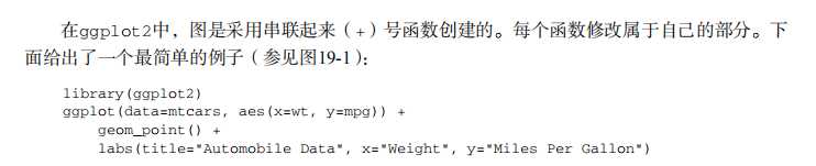
ggplot(data=mtcars, aes(x=wt, y=mpg)) +
geom_point() +
labs(title="Automobile Data", x="Weight", y="Miles Per Gallon")
# Scatter plot with additional options
library(ggplot2)
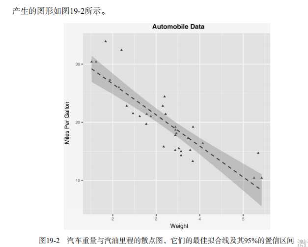
ggplot(data=mtcars, aes(x=wt, y=mpg)) +
geom_point(pch=17, color="blue", size=2) +
geom_smooth(method="lm", color="red", linetype=2) +
labs(title="Automobile Data", x="Weight", y="Miles Per Gallon")
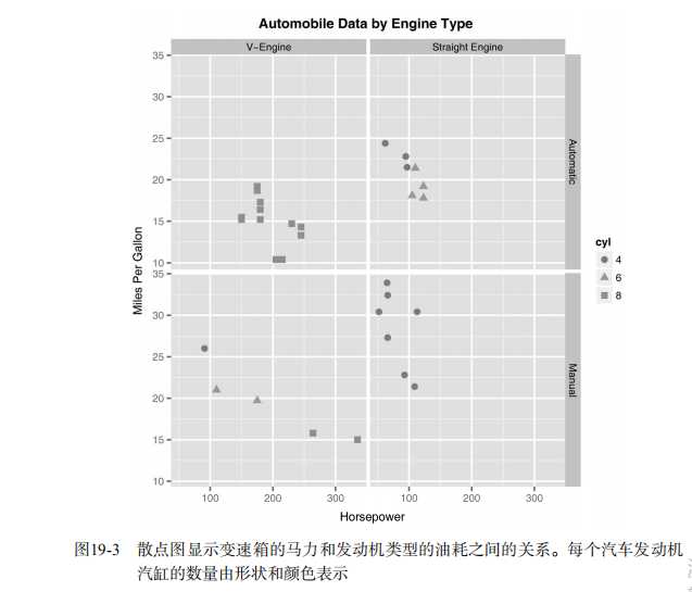
# Scatter plot with faceting and grouping
data(mtcars)
mtcars$am ),
labels=c("Automatic", "Manual"))
mtcars$vs ),
labels=c("V-Engine", "Straight Engine"))
mtcars$cyl factor(mtcars$cyl)
library(ggplot2)
ggplot(data=mtcars, aes(x=hp, y=mpg,
shape=cyl, color=cyl)) +
geom_point(size=3) +
facet_grid(am~vs) +
labs(title="Automobile Data by Engine Type",
x="Horsepower", y="Miles Per Gallon")
# Using geoms
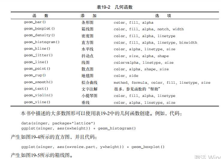
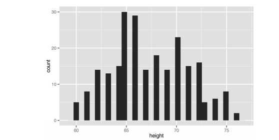
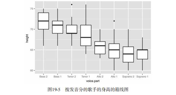
data(singer, package="lattice")
ggplot(singer, aes(x=height)) + geom_histogram()
ggplot(singer, aes(x=voice.part, y=height)) + geom_boxplot()
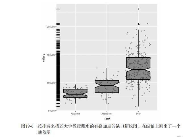
data(Salaries, package="car")
library(ggplot2)
ggplot(Salaries, aes(x=rank, y=salary)) +
geom_boxplot(fill="cornflowerblue",
color="black", notch=TRUE)+
geom_point(position="jitter", color="blue", alpha=.5)+
geom_rug(side="l", color="black")
# Grouping
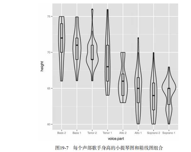
library(ggplot2)
data(singer, package="lattice")
ggplot(singer, aes(x=voice.part, y=height)) +
geom_violin(fill="lightblue") +
geom_boxplot(fill="lightgreen", width=.2)
data(Salaries, package="car")
library(ggplot2)
ggplot(data=Salaries, aes(x=salary, fill=rank)) +
geom_density(alpha=.3)
ggplot(Salaries, aes(x=yrs.since.phd, y=salary, color=rank,
shape=sex)) + geom_point()
ggplot(Salaries, aes(x=rank, fill=sex)) +
geom_bar(position="stack") + labs(title=‘position="stack"‘)
ggplot(Salaries, aes(x=rank, fill=sex)) +
geom_bar(position="dodge") + labs(title=‘position="dodge"‘)
ggplot(Salaries, aes(x=rank, fill=sex)) +
geom_bar(position="fill") + labs(title=‘position="fill"‘)
# Placing options
ggplot(Salaries, aes(x=rank, fill=sex))+ geom_bar()
ggplot(Salaries, aes(x=rank)) + geom_bar(fill="red")
ggplot(Salaries, aes(x=rank, fill="red")) + geom_bar()
# Faceting
data(singer, package="lattice")
library(ggplot2)
ggplot(data=singer, aes(x=height)) +
geom_histogram() +
facet_wrap(~voice.part, nrow=4)
library(ggplot2)
ggplot(Salaries, aes(x=yrs.since.phd, y=salary, color=rank,
shape=rank)) + geom_point() + facet_grid(.~sex)
data(singer, package="lattice")
library(ggplot2)
ggplot(data=singer, aes(x=height, fill=voice.part)) +
geom_density() +
facet_grid(voice.part~.)
# Adding smoothed lines
data(Salaries, package="car")
library(ggplot2)
ggplot(data=Salaries, aes(x=yrs.since.phd, y=salary)) +
geom_smooth() + geom_point()
ggplot(data=Salaries, aes(x=yrs.since.phd, y=salary,
linetype=sex, shape=sex, color=sex)) +
geom_smooth(method=lm, formula=y~poly(x,2),
se=FALSE, size=1) +
geom_point(size=2)
# Modifying axes
data(Salaries,package="car")
library(ggplot2)
ggplot(data=Salaries, aes(x=rank, y=salary, fill=sex)) +
geom_boxplot() +
scale_x_discrete(breaks=c("AsstProf", "AssocProf", "Prof"),
labels=c("Assistant\nProfessor",
"Associate\nProfessor",
"Full\nProfessor")) +
scale_y_continuous(breaks=c(50000, 100000, 150000, 200000),
labels=c("$50K", "$100K", "$150K", "$200K")) +
labs(title="Faculty Salary by Rank and Sex", x="", y="")
# Legends
data(Salaries,package="car")
library(ggplot2)
ggplot(data=Salaries, aes(x=rank, y=salary, fill=sex)) +
geom_boxplot() +
scale_x_discrete(breaks=c("AsstProf", "AssocProf", "Prof"),
labels=c("Assistant\nProfessor",
"Associate\nProfessor",
"Full\nProfessor")) +
scale_y_continuous(breaks=c(50000, 100000, 150000, 200000),
labels=c("$50K", "$100K", "$150K", "$200K")) +
labs(title="Faculty Salary by Rank and Gender",
x="", y="", fill="Gender") +
theme(legend.position=c(.1,.8))
# Scales
ggplot(mtcars, aes(x=wt, y=mpg, size=disp)) +
geom_point(shape=21, color="black", fill="cornsilk") +
labs(x="Weight", y="Miles Per Gallon",
title="Bubble Chart", size="Engine\nDisplacement")
data(Salaries, package="car")
ggplot(data=Salaries, aes(x=yrs.since.phd, y=salary, color=rank)) +
scale_color_manual(values=c("orange", "olivedrab", "navy")) +
geom_point(size=2)
ggplot(data=Salaries, aes(x=yrs.since.phd, y=salary, color=rank)) +
scale_color_brewer(palette="Set1") + geom_point(size=2)
library(RColorBrewer)
display.brewer.all()
# Themes
data(Salaries, package="car")
library(ggplot2)
mytheme "bold.italic",
size="14", color="brown"),
axis.title=element_text(face="bold.italic",
size=10, color="brown"),
axis.text=element_text(face="bold", size=9,
color="darkblue"),
panel.background=element_rect(fill="white",
color="darkblue"),
panel.grid.major.y=element_line(color="grey",
linetype=1),
panel.grid.minor.y=element_line(color="grey",
linetype=2),
panel.grid.minor.x=element_blank(),
legend.position="top")
ggplot(Salaries, aes(x=rank, y=salary, fill=sex)) +
geom_boxplot() +
labs(title="Salary by Rank and Sex",
x="Rank", y="Salary") +
mytheme
# Multiple graphs per page
data(Salaries, package="car")
library(ggplot2)
p1 geom_bar()
p2 geom_bar()
p3 geom_point()
library(gridExtra)
grid.arrange(p1, p2, p3, ncol=3)
# Saving graphs
ggplot(data=mtcars, aes(x=mpg)) + geom_histogram()
ggsave(file="mygraph.pdf")
文章标题:吴裕雄--天生自然 R语言开发学习:使用ggplot2进行高级绘图
文章链接:http://soscw.com/essay/32932.html